
Seeing Human Migration With Fresh Eyes: The Fuller Dymaxion Map
How a 1940s cartographic innovation helps us visualize 275,000 years of human movement

There’s something deeply unsatisfying about looking at human migration on a standard world map. The familiar Mercator projection, the one we all grew up with, distorts the world in ways that make understanding our species’ journey nearly impossible. Greenland appears larger than Africa. The vast distances our ancestors crossed by foot look trivially short. And worst of all, the arbitrary cuts at the map’s edges sever the very connections that made migration possible.
What if we could see it differently?
One Island Earth
In 1943, Buckminster Fuller introduced his Dymaxion map, a radical reimagining of how we represent our planet. The projection unfolds Earth onto an icosahedron (a 20-sided polyhedron) that can be flattened with remarkably little distortion. More importantly, Fuller arranged the faces so that all landmasses appear as a single, nearly continuous island surrounded by one world ocean.
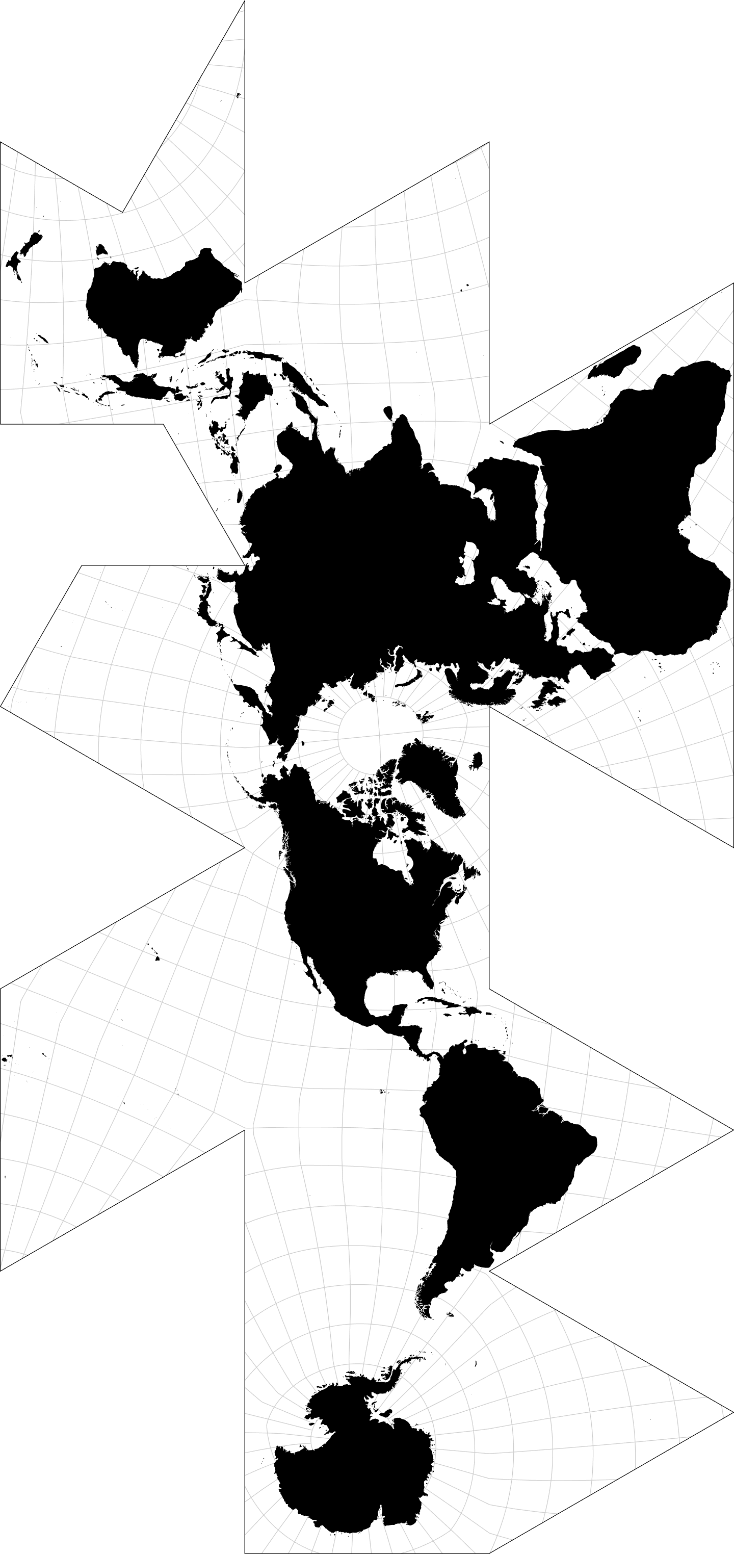
This wasn’t just a cartographic trick. It was a philosophical statement: we live on one interconnected world.
For visualizing human migration, this perspective is transformative. When you watch the paternal Y-chromosome lineages spread from their African origins across the globe, you’re not fighting against artificial map edges. The coastal route from Africa to Australia flows naturally. The Bering land bridge connecting Asia to the Americas makes geographic sense. The world becomes readable as a continuous journey.
Try the interactive map: HERE 275,000 Years in Your Browser
The map I’ve built traces over 200 migration events spanning from Y-chromosomal Adam in East Africa to the Polynesian expansion across the Pacific. Each colored path represents a branching of the human family tree, moments when populations split, migrated, and established new lineages that persist in billions of people today.
The time slider lets you watch this story unfold. Set it to 70,000 years ago and see the critical “Out of Africa” moment when haplogroup CT crossed into the Near East. Push forward to 15,000 years ago and watch Q-lineage populations cross Beringia into the Americas. The haplogroup selector lets you trace any lineage back to its roots—select R1b (common in Western Europe) and follow the path backward through R1, R, P, K, all the way to the original African divergence.
The Ice Age Coastline
Here’s something that standard maps never show you: the world our ancestors actually walked across.
During the Last Glacial Maximum around 20,000 years ago, sea levels were 120-130 meters lower than today. The map includes a toggleable “Ice Age Coastline” layer showing the approximate exposed land. Suddenly, the migrations make more sense:
- Sundaland: Southeast Asia was a massive peninsula connecting Indonesia to the mainland, the superhighway for the southern coastal route to Australia
- Beringia: A wide land bridge, not a narrow crossing, connecting Siberia to Alaska
- Doggerland: Britain connected to continental Europe, now submerged beneath the North Sea
These weren’t desperate ocean crossings. They were walks across grasslands and coastlines that no longer exist.
Built on Open Source
This project stands on the shoulders of remarkable open source work:
Natural Earth (naturalearthdata.com) provides the foundational map data, coastlines, country boundaries, lakes, and glaciated areas, all in the public domain. Their bathymetry data enables the ice age coastline visualization.
D3.js and d3-geo-polygon handle the complex mathematics of projecting geographic coordinates onto Fuller’s icosahedral arrangement. The geoAirocean() projection implementation makes what would be months of geometric work into a single function call.
React provides the interactive framework, making it possible to smoothly filter 200+ migration events by time period and haplogroup lineage in real-time.
The migration data itself is compiled from published research on Y-chromosome phylogenetics, the molecular clock that lets us date when lineages diverged and correlate those dates with archaeological evidence of human presence.
Why This Matters
We live in an era of increasing tribalism, where maps are drawn to emphasize divisions. The Dymaxion projection offers a quiet corrective. When you see human migration on Fuller’s map, the story isn’t about separate peoples on separate continents. It’s about one family, walking together and apart across one world, over deep time.
Every person alive today carries genetic markers connecting them to specific branches of this journey. The R1b lineage in an Irish farmer, the O lineage in a Chinese businessman, the Q lineage in a Peruvian villager, all trace back through this same tree to the same African origins.
The map makes this visible in a way that words cannot.
Explore It Yourself
The interactive map is live at https://practicallyzen.com/fuller-map/index.html
- Toggle the Ice Age Coastline layer to see the world our ancestors knew
- Use the time slider to watch migration unfold chronologically
- Select specific haplogroups to trace individual lineages back to their origins
- Zoom and pan to explore regions in detail
The code is built with modern web technologies and runs entirely in your browser—no server required, no data collected.
The Y-haplogroup data in this visualization spans 275,000 years of human paternal lineage, from the earliest known Y-chromosome branches (A00 in Cameroon) through the historical expansions of the last few thousand years. It represents our best current scientific understanding of human paternal migration patterns, though new genetic studies continue to refine the picture. And too this we can add one more data point form 700,000 years ago in Moracco.
Too busy to click a link? Here’s an animation.
Update 20260126:
I’ve add mtDNA to the map. Both animations between at 275 kya and advance to the present.
-J
References:
Robert W. Grey “Exact Transformation Equations for Fuller’s World Map”